This week for tech we did some sticker making.
For sticker making I made a MTG sticker. MTG is magic the gathering, which is a card game I play and I find it very fun. How we made a sticker is first we coped a photo we liked then we put it in a sticker format called cutstudio. After that we picked the size for our sticker, my size was 100mm. Next we pressed cutting on the Chromebook and picked the cutter we were using. After that the cutting thing would start cutting out the design. After that we would get the design out and peel off the sticker. T hen we would put tape on it and put it where we wanted it.
I think I used rise value success because at the end I found out how to make stickers.
Next time I would like to make more stickers.
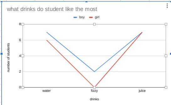 today in math we gathered data and used google sheets to make a column graph . our topic was preferred drinks and our variable was gender.